NPR: Non-Photo Realistic Rendering

Happy 2017 design readers.

Over the break I’ve made a concerted effort to work on some new digital rendering techniques.  As anybody who has followed this blog or knows my work may attest, I personally avoid doing photo realistic renderings.  I came up in this business during the analog/manual era … actually on the cusp of computer models and visualization.  I was modeling/rendering on AutoCAD 3D 15+ years ago … you remember the UCS don’t you?  The “Ultra Confusion System”?  I got some nice renderings but ultimately decided it wasn’t for me.  Individual, hand drawing techniques are just more interesting (and faster) than perfect photo-like creations.  So, have a look at two NPR rendering examples, both of which were developed in Sketchup.

The first is a series of conference table variations I worked on late in 2016.  I had three basic ideas and I wanted to show them together, with my favorite in the foreground.

NPR Conference Table Sketchup Renderings by Mick Ricereto

Once you have your design, setting up views like this takes seconds.  And if I want some alternate views, turn the mouse a bit and go.  Once you build up a library of materials again click click and it all moves very fast.

Next is a kitchen that goes back a couple of years to 2015 (wow – 2015 is now two years ago!).  As with the conference tables above, the secret sauce is getting the line work to replicate my hardline pencil base drawings, but in this case I also had the floor and an exterior to simulate as well.

NPR Kitchen Rendering in Sketchup by Mick Ricereto

Again, if I want another view, I just go for it and do my 3 second re-render right in Sketchup.  There is no outboard rendering program to bother with, just some post work in P-Shop (just like their would be with hand drawing).

With hand presentation it’s either very quick sketchy styles or taking a huge amount of time for more detailed materials and multiple views.  And then you still need to scan them in and touch up as well.  I will still sketch live in front of clients and colleagues the same way, but when presenting more defined designs (like above), back in the studio, I’m very excited to be exploring NPR Sketchup models.  This is like a huge breath of fresh air for me as I can work very quickly and still get individually-styled presentations that I’m happy with.  Also, if it needs to be more realistic, off to a rendering farm it can go (just like rapid prototyping – no need to do it in-house anymore).

I’m looking forward to 2017, getting better and faster.  I hope you’re also off to a cracking start and best wishes in all your endeavors.

M


Knocked Off Again

Knockoff.  Webster’s definition reads as “a cheap of inferior copy of something”.  A bit similar to “knock down” and “knockout” but to be sure I refer to plagiarized, and again by a big box store with the victim being an Amerock hardware design.

Rolling into the Box one evening looking for blue painter’s tape and some CFLs, I passed this forlorn little vanity ensemble:

img_3161

The unit’s cup pull is as close to my Amerock Manor pull as one can get, only not as wide.

img_3162

Here is Amerock’s official view of the Manor pull – model number BP26130 – for some reason shown from the bottom:

amerock-bp26130g10-lg

I designed this piece of hardware way back in 2003-2004, while living in Washington DC.  I used to wander the majestic avenues looking for architectural inspiration.  In this case, I was thinking of some details I liked in Daniel Burnham’s Union Station.  I’ve blogged about Union Station before I think … ah yes, here is a picture of the entrance vestibule:

Detail of Union Station in Washington DC

When I started with Amerock in late 2003, they were thick in the transition from a domestic manufacturing company to a run-of-the-mill importing brand.  Needing new designs to be made in China and appeal to the mass market, I whipped up some collections that would have timeless appeal and work with a myriad of cabinet and interior styles.  Manor was actually the first design I did for them.  In fact, the Manor knob was my very first design, penned in late 2003:

amerock-manor-square-knob

As I have stated before, I don’t mind so much to be knocked off as I can just design another knob or handle very quickly.  In this case I’m actually a bit proud to think a 13 year design still holds up enough to be copied so blatantly.  My goal of “timeless appeal” seems to have been met.

While I will continue using the world’s architectural monuments for inspiration – as any good artist should – some will simply copy other’s designs.  I don’t suppose there are great old buildings and fascinating streets to wander out in the Big Box corporate park, but that should not be an excuse for failing to come up with an original design.

Pirch Soho NY

On Saturday, May 21 Pirch Soho opened at the corner of Lafayette and Broome in New York City.  On Thursday, I attended the VIP opening party with the rest of the SieMatic and Fitch design teams.  As long-time readers know, I have been designing the kitchen areas for the Pirch stores, and Soho is unquestionably our best.  Here are some impressions of the finished store and the grand opening party.

Blog Subway

The buzz starts on your subway ride to Spring Street.  Pirch has advertisements throughout the subway using celebrities in the decorating and gourmet arenas.

Blog Ext Sign

The building itself is a fine old stone/brick manufacturing/office building, lovingly restored.  The store itself covers 32000 square feet and actually comprises space from at least two buildings, as the grade change and brick arches inside reveal.  The exterior brickwork and paint is exceptional.

Blog Exterior

Approaching the store after 6pm, guests experienced a velvet rope line up the block and tuxedo-clad “security”.  Yes, quite the buzz.

Entry View of Pirch Soho New York

Above is the view upon entry; SieMatic is the very first thing you see, even before the standard Pirch complimentary cafe.  SieMatic was very fortunate to get involved with the store layout early in the design process.  We were able to implement SieMatic’s vision of Timeless Elegance and Journey of Discovery by ensuring lots of space around each kitchen environment and letting the architecture inspire our layouts and material choices.

SieMatic S2 Agate Grey Soho New York

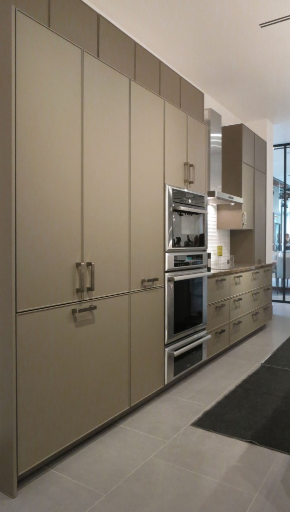
This first display features Gaggenau appliances, with a freezer and refrigerator clad with Black Oak veneer and the balance of the cabinets in Agate Grey matte lacquer.  The open layout and floating shelves are minimal and contribute to the spacious feel.

SieMatic SC40 Umbra Kitchen at Pirch Soho

As one walks throughout the space new display environments reveal themselves around wall blocks and glass screen walls.  As they were setting up for the party, some of the larger areas were dominated by catering and DJ equipment so this shows only a portion of what is on offer.

SieMatic Viking Display at Pirch Soho New York

Appliances on display include Sub Zero, Wolf, Viking, Miele, Gaggenau, Monogram … essentially the best available in the market today.

SieMatic 3003RLM Nutmeg display at Pirch Soho

SieMatic’s new 3003 door features a very thin 6.5mm edge detail in matte Nutmeg lacquer.  We mixed a very subtle aged bronze accent color into this display, as seen on the handles.  Up front we show another 3003 in Graphite lacquer, this one featuring Miele appliances and stainless steel accents.

SieMatic and Miele Display at Pirch Soho New York

Realistic seating areas are included where we could fit them, as this completes the domestic feel but also these areas are where the Pirch and SieMatic customer consultations start as guests receive exceptional and personalized service when shopping at Pirch.

SieMatic 3003RLM display in Pirch Soho New York

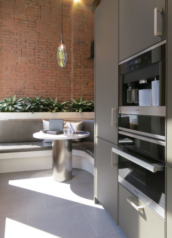
The Miele display is tucked into the window on the Broome side of the store, shown behind the stair area below.  This little display may not be much in size but when customers explore each area of the store little surprises like this small kitchen area come to life.

Stairs at Pirch Soho New York

Pirch offers kitchens, bathrooms and outdoor living furniture and fixtures.  A view to a bath environment on the second floor shows how the store designers (Fitch of Columbus OH) aimed to show complete environments in the design.  Note – all faucets and bath fillers and shower heads are fully functional for a very realistic experience.

Glog Bathroom

The spaces on the second floor are more intimate due to a lower ceiling and window height.  We responded to this feature by making the kitchen areas smaller and more realistic by building them in with walls and the ceilings properly.  This “Innovation Loft” kitchen takes up the corner of the second floor and is part of an apartment suite.  There are many home-organization and entertainment media screens embedded into the design like in the table and on top of the counter top.

SieMatic Loft Area at Pirch Soho New York

The loft is fairly small so a good view of this area was a bit hard to capture properly.  I didn’t venture upstairs during the party to see how this area was received but I’ll pop-up to NY occasionally to see how the store is doing “in action” and report back.

SieMatic Loft Area at Pirch Soho New York

We used as many new SieMatic features as we could, including these open shelves from the “URBAN” collection of furniture, quite appropriate to New York’s apartment-dwelling clientele.

SieMatic SC10 Graphite Cabinetry at Pirch Soho New York

Marcia Speer of SieMatic poses with me for our obligatory party shot.  Marcia and I work very close on these stores, selecting materials and shaping the overall product offering and interfacing with the Pirch team to get the mix of cabinets, counter tops and appliances just right.  In addition we have a team of bright designers, managers and installation experts at SieMatic who help put the whole thing together – too many to note here but they know who they are and if reading this, please recognize that I cannot take any credit for this work without your invaluable help!

Designer Mick Ricereto and Marcia Speer of SieMatic at the Pirch Soho New York Grand Opening

Next up for Pirch and SieMatic is the exciting addition of Austin TX.  We have almost completed this design and it should be open by early 2017.

I know this latest store is the best for SieMatic and Pirch and I’m sure it will be a smashing success.  When you are in NY please stop by and see the store and let us know how we are doing.

Working in Sketchup

Like many designers (and also hobbyists), I have been recently enamored to Sketchup.  For those unfamiliar, Sketchup is a free* 3D design software associated with Google (but sold off a few years ago to a company called Trimble).  I have been using SU to work on environment design (as opposed to product design), as it is very quick to get ideas across and quickly develop views to communicate your design intent.

Seating Area Sketch

3 Minute “Napkin Sketches” – Essential to the Design Process

Most will maintain that drawing by hand is an essential function to working out your designs.  Many are familiar with the story of a “napkin sketch”, or a squiggly Frank Gehry concept drawing; there will always be a place for quick sketches.  With tools like free 3D design packages however, detailed hand drawings are becoming too difficult to justify.

SieMatic Beaux Arts 2 Kitchen for Client in Bermuda

Hand Rendering – Charming but time to move on?

Did I say *Free?  The basic program is free but a Pro version allows many more features including the full-featured Layout element which is similar to Paper Space in AutoCAD.  I use Pro as I would like to master the Layout feature and eventually move away from ACAD.

Entry 2

Sketchup – A Quick Design and Communication Tool

As mentioned before in previous posts, I’m well aware the time-consuming method of drawing by hand is charming but inefficient in today’s design world.  Although I can draw quite quickly in a loose fashion (napkin sketches and so on), more and more of my clients are used to seeing photo-realistic renderings and as this becomes the norm pencil and marker sketches just simply will not cut it.  It isn’t the speed and the efficiency alone that renders hand drawings obsolete (sorry), but the fact that realism is so easily obtainable and frankly expected in luxury interior presentations.  Worst is when you need to present a few options in the same space; this is where digital designing such as SU can manage things in a few clicks.

Classic Main Alt

Basic SU Presentation.  No Post-SU rendering needed for quick images such as this.

Although my screen shots show basic line work, you can always export your SU model to a rendering package (also inexpensive) to get into photo realism.  It should be noted there are consultancies – many in Eastern Europe or Asia – who do nothing but make renderings of complex buildings and other important 3D projects.  These “Rendering Farms” have super computers toiling away to make your models look like the CGI from Skywalker Ranch.

After working in SU for a year or two, it became quite clear that although I don’t need CGI-level rendering yet, the quality of materials representation and purchasable interior elements make a big difference to the quality of your design.  Looking at my screen shots above, I’m referring to not only the realism of the stone floor but the appliances, the paintings I placed on the wall (small replications of a friend’s work), the chairs – all the things we called Entourage back in the pens-and-marker days.  With hand drawings you draw these elements yourself, or Photoshop things in later.  With 3D design, you can insert scale models of products into your room.  One of Sketchup’s most powerful features is their database of objects you can download and use in your design; the 3D Warehouse.

SU Warehouse Image

A View to Mick’s 3D Warehouse Page

The 3DW is a user-uploaded repository of free models.  If it has been uploaded to the Warehouse, you can use it.  Some “power users” display entire buildings and iconic models they constructed in the manner of a gallery.  I have seen the Empire State Building, Endeavor Space Shuttle, Tie Fighters … there are some incredible models uploaded to the 3DW.  For me and other furniture designers/manufacturers however, the 3DW presents a unique opportunity to get our products in the hands of architects and specifiers.  By having your commercially-available designs in the 3DW, there is a very good chance of having your pieces specified when the design gets executed in real life.  With this in mind, I have recently been converting my product designs to the SU 3DW format and uploading them for other designers and hobbyists to use.  In the first week I had a couple of hundred downloads of some of my lighting designs.  Who is looking at/using my product models?  This I do not know, as there is not a feedback loop or way to track who is using what.

SU Screenshot

Screen Shot of Sketchup Interface – and the Popular Ilex SPAL24 Space Array Fixture

So far the most popular of my products is the above Space Array fixture, at over a hundred downloads by itself.  Not bad for the first week.  I looked at some iconic furniture pieces by well-known manufacturers and their downloads were in the many thousands.  Surely some of these model usages will result in actual sales, right?

How many of you, dear readers, are using Sketchup and the 3D Warehouse?  Do you use actual products you intend to specify for the final project?  Does the availability of a model on the 3DW increase your chance of using it in real life?

With dozens of lighting fixtures currently in production – not to mention the scores of Amerock hardware designs I did between 2004 and 2009 – I could put a huge amount of product on the 3DW.  I’ll continue to focus on the newer and better designs for now, with the hope of getting a wider audience for my more marketable designs.

If you are a Sketchup user please have a visit to my product gallery and try some of my lighting and hardware in your models.  I’d love to know how they work in your designs.

https://3dwarehouse.sketchup.com/by/MickRicereto

Recent Projects and Renderings

As the holiday season gets into full swing here in the States, we are wrapping up some private projects, studio designs and renderings for other designers.  Everybody likes hand renderings so I will share some of the more interesting rooms we have been working on.

First up is a difficult kitchen space for our good friends in California.  This is a stunning house, but with an odd shape to the kitchen which took some clever design to get organized.  The designers moved some doors and windows around to get a better spatial flow to the room.  We didn’t do much here, other than render the design.  Cabinets are SieMatic Classic, in Sterling Grey gloss lacquer.

California Kitchen Rendering by Mick Ricereto

Next up is a more eclectic design in a very traditional house in South Carolina.  The client wanted something darker and more modern in this – again – difficult-shaped kitchen space.  We helped add some character to the room by designing a banquette and treating the existing brick wall with a Silestone wainscoting to tie the kitchen finishes and the architecture together.  I could completely see myself sipping coffee by the window on a nice spring morning.

Umber Gloss Lacquer Eclectic KitchenThis next project was a rendering for a real estate developer in Florida.  This is a small kitchen, but using the same care we use on our big design projects.  Where prospective home buyers would normally expect a basic digital rendering of the space, we like to think this accessorized and inviting view gives a better impression of the builder’s product.

Small Kitchen Rendering by Mick Ricereto

This next project are renderings for a villa in Hawaii.  The designers were looking to update the traditional Japanese-style interior to a more minimalist and clean look, while retaining the incredible inside-outside living that is unique to this climate.  First is the great room, with a view to the dining table and sitting area.  The kitchen is behind the camera in this view.

Hawaii Resort Interior RenderingThe floor here is slate, which continues inside and out seamlessly.  The sliding doors are shown here pocketed; there is almost no divider between the outdoors and in.  The next view is the bathroom, which has an open arrangement to allow a great view from the bathtub.

Hawaii Resort Bathroom RenderingThe bedroom has a similar set of sliding doors to the outside.  The piece on the wall is a Donald Judd-style wall sculpture.

Hawaii Resort Bedroom Rendering by Mick RiceretoBack to kitchens, here is our third prize winning entry to the Blanco Dream Kitchen contest from this past October.  The rules required the fitting of a Blanco sink and faucet (which we use extensively in most of our projects), but otherwise the design and style of one’s entry was completely open for creativity.  Our design is a very modern and modest kitchen using grey woods, stainless steel and for the room’s centerpiece, a black Corian custom angled island.  Our Ilex Space Array chandelier in black is above the sink/eating area, and this finish ties in to the blackened oak tall cabinets/room divider to the right.

Modern Kitchen Concept by Mick RiceretoI like how our Blanco project resembles the Hawaii resort above.  The lifestyle is not dissimilar, although our space is in a North American urban area; the desire to bring the outdoors in is an almost universal request when designing living spaces today.

The Blanco contest results can be seen in this issue of Blanco’s online magazine Here

The next project is a rendering for our colleagues in California, a kitchen for an industry executive.  We worked carefully on the proportions of these upper cabinets as the ceiling is a bit low and we didn’t want to misrepresent the design by making it appear taller than it actually is.  Hand rendering of course should be considered an “artist’s impression”, but that doesn’t mean we should not strive for accuracy in the design.

SieMatic Beaux Arts Class Kitchen Rendering by Mick RiceretoThis last project was done earlier in the autumn; a nice big traditional kitchen for our friends again in South Carolina.  This is an expertly-tailored space with some very nice door details.  Again, another kitchen with a lot of openings and a tricky space to design but I think the room comes together with an exquisite use of vertical proportions and a consistent horizontal datum.

SieMatic Classic Beaux Arts Kitchen Rendering by Mick Ricereto

In addition to these residential renderings we have some private kitchens and as usual, kitchen studio projects and other retail spaces on our boards.  2015 has been a busy year here in our new Philadelphia studio.  We look forward to some relaxation time this holiday season and continued growth for 2016.  Thanks for visiting the blog and please also see our Facebook page Here for photos, travel impressions and general goings-on at Mick Ricereto Interior + Product Design.


Recent Kitchen Renderings

We’ve recently done renderings for other designer’s kitchen projects.  Although my first inclination is to work in a more modern context, when helping out colleagues I’m often involved with “classic” designs.  These two SieMatic Beaux Arts kitchens are typical examples of a single-view rendering needed to supplement a high-end kitchen renovation proposal.  The client may otherwise only have a plan and elevation to fully understand the design intent; renderings help the project come alive.

SieMatic Beaux Arts Rendering by Mick Ricereto

This first example shows how the designers integrated the cabinets into the architecture of the room.  Careful planning of horizontal joints and header heights pull it all together.  Spaces like this – kitchen as hub of the house with many ways in and out – can be particularly challenging to work with but they did a great job in tying it all together.

This next project came with a low ceiling and existing skylight structure, for which the designers put considerable attention into the upper cabinets to get the right proportions.

SieMatic Beaux Arts Class Kitchen Rendering by Mick Ricereto

I needed to carefully draw my base layout to accurately portray the widths and heights of the design elements.  Since I draw everything by hand and do everything by eye/feel (no measurements whatsoever), sometimes there are false starts where you get the angle a bit wrong and need to start over.  Again I think this design solves the room’s challenges well and the interesting soffit bits keep your eye moving and make this a special room.

I’m often asked why I continue to do hand drawings when I could model in Sketchup or others and have unlimited views.  Well, I do actually, but hand drawings are fun and you “wright” a design instead of just click it to life.  The designer’s organic connection to the paper and the scraping medium which makes the marks (the pencils and pens) provide a feedback which is just different to working on a computer.

Another recent project was designed for a competition.  I’ll share the rendering here as it is a bit more my preferred flavor of style.  This is my design, from a completely white sheet of paper.  Lots of care went into finishes, such as stainless steel base cabinets, black matte oak on the tall cabinets/room divider at right, the deeply-combed grey oak floor and the angled black Corian island.  The idea was to place an interesting island in an otherwise basic square room to show how just a few new ideas could create a dynamic design.

Modern Kitchen Concept by Mick Ricereto

The island has a polished stainless steel leg on only one side.  I tested this in scale and with the massive base at the left end, it is remarkably stable.  Notice the shadow lines above the shelf at left and black oak wall divider cabinets at right; I do not like taking cabinets to the ceiling and much prefer to use a shadow gap.  A gap at the top expands the room visually and is easier to install.

We have been busy with some industrial design projects and helping out with the Design Philadelphia festival here in town.  I’ll post more hand renderings from time-to-time so thanks for viewing and see also our Facebook page for other recent projects.

IMM – Germany – Part One

I ventured over to Europe for the IMM this year – International Mobile Messe – in Cologne Germany.  As part of a group of SieMatic dealers from North America, we also went to Amsterdam to see the company’s newest flagship showroom.  I’ll share some pictures of that wonderful installation in a future post; for now, here are some images from IMM.

1970's Feel at IMM Cologne 2015

Starting with some living spaces, among the trends I saw were 1970’s influences and softer, feminine colorways.  Although many companies are still working in a minimalist vein, there were lots of eclectic ensembles mixing style, colors, textures, gathered and otherwise complex upholstery treatments and interesting accessories.

Porada Dining Chair

This dining set had a very 1970’s vibe to it, with curved cushions, glass top table and organically-curved woodwork.

The use of bronze-colored metal was very prevalent.  This collection of cocktail tables used faceted surfaces and rich materials in a lovely manner:

IMM 2015

Also in use were gold and brass tones, a trend we have been talking about for the better part of a decade.  Every year more and more brass is seen and it still feels very fresh and underused.

Living room at IMM 2015

Greys are presently the “it” tone in European design.  Although there were many masculine presentations throughout the halls, as mentioned above a feminine touch is frequently felt through accessories, color accents and great fabrics.  Notice the tufting below.

Grey Furniture at IMM 2015

I loved these accessories at Interluebke:

Console at IMM 2015

The ceiling treatment at Cor, a German company, were very inventive.  Each living ensemble had an individual deep ceiling with creative arrays of lighting.

Cor Ceiling at IMM 2015

Another trend was the use of black and white pattern, such as dots, hounds tooth and the like.  Readers who have been at the design game for a few decades may recognize this palette from the late ’70s and into the 1980s.  This pair of chairs below reminds me of the old TGV train interiors, which had black and white striped chairs with a red carpet and window curtains.

1970's Influences at IMM 2015

A black and white laminate treatment:

Black and White Patterns at IMM 2015

This closet environment at Poliform shows a great ziggurat carpet in black and white, as well as other fabulous details in casework and accessory placement.

Ziggurat Carpet

Great wallpaper mixed in with a lovely plush fabric at B&B Italia.

B&B at IMM 2015

The Michel series at B&B – a system I like to specify – against some nice black and white ticking:

Michel from B&B Italia

And for something a bit different, this bohemian tropical luxury look had many admirers.  I forgot to write down the company in my notebook, but this was not a completely isolated look, as many other makers indulged in such comfy-casual presentations.

Deep Island-Style Luxury at IMM 2015

This is a good place to break, so I can pick up on more individual and eclectic furnishings and accessories in the next installment.  And of course, also coming up with be kitchens as well, including all of SieMatic’s new collections.

New SieMatic Showroom – Konst – Bethesda MD

Our latest showroom design for SieMatic is now open in Bethesda, MD.  Konst – meaning “art” in Swedish, is owner Jonas Carnemark’s third studio renovation/location in a decade.  Locking down a busy corner of Wisconsin Ave. near the Bethesda Metro station, this latest move – just a block away from the old building – is a gigantic leap in street and sidewalk exposure.

Konst SieMatic Showroom ExteriorOur previous showroom space was constructed over two renovation phases, which left an incongruous layout from end-to-end.  This new space is more linear, showing a straight progression of SieMatic design as one enters and meanders counter-clockwise around the space.

This view from opening night in early October shows the great storefront exposure on the front of the building.

As motorists and pedestrians come down Wisconsin Ave towards Washington DC, this large SieMatic logo beckons proudly on the modernist façade from blocks away.

The first display consists of a simple white laminate island positioned before a large, continuous-grain natural walnut cabinet wall.  Behind the paneling are fridges and freezers, hidden storage areas and audio-visual equipment.

Konst SieMatic Display 1

The building features a large chamfered corner on Wisconsin Ave, so we chose to angle the front display parallel to this edge.  Keeping the floor longitudinal but aligning the LED ceiling strips adds dynamics to the youthful room feel.

SieMatic Shelf DetailWhile most of the storage is closed and otherwise hidden, we added a Floating Spaces shelf to the end for accent.

A large display monitor shows loops of SieMatic and Konst design features while Miele’s latest white glass appliances make a bright accent on the left side for balance.

Visitors walk around the right side of the display for their first look of display 2 and the rest of the space.

SieMatic Display at Konst SieMatic

The second display presents a large suite of space with S2 in Oak and SLG “similacque” glossy laminate, adjacent to the Beaux Arts 2.0 display at the rear.  A SieMatic table and benches is just out of view behind the Algue screen by Ronan & Erwan Bouroullec for Vitra at left.

The Beaux Arts takes up the anchor space at rear with a large seating area, media center/fireplace and entrance to samples areas and service space.

SieMatic Beaux Arts display at Konst

The display follows SieMatic’s usual Beaux Arts philosophy of using metal, gloss lacquer and wood and asymmetrical balance to create this unique feel.  With these photos taken only a few minutes before the opening party, I’ll need to return for more pictures of details and the seating areas.

We are particularly proud of this latest studio, and wish the staff at Konst the best luck at this new location.  Based on the level of interest passersby expressed during my site visits – as well as the tremendous response on opening night – I’m sure this location will prove more successful than their old spaces.

Visit Konst online and browse the excellent work they have been doing for the past few years and do make sure to drop in when in the Washington DC/Bethesda area.


SieMatic NY Wins Showroom of the Year Award

The New York SieMatic showroom has won the KBB Magazine 2014 Showroom of the Year award.  Kitchen and Bath Business magazine, sponsor of America’s Kitchen and Bath Industry Show, is the industry’s leading professional publication.  We also won this award for the Charleston showroom back in 2009 and I’m proud to be a part of another award-winning project with SieMatic.

KBB Award Winning ShowroomA full analysis of the design can be read in my previous post of the showroom opening.  SieMatic is leading the shift to experience-based environments in today’s kitchen showroom design, and wanted to make a big statement with the studio in NY’s A&D building.  In comparison with the old layout (a series of small kitchen compartments, each representing a singular look), the new idea is two large apartment environments showing examples of the best in NY living.  With new studios under planning and opening soon – Amsterdam, London, Melbourne – SieMatic is moving towards this model around the world.

SieMatic New York KBB Magazine

I’m pleased the photographers chose to hone in on some of the styling elements – I worked hard to source and place those objects!

SieMatic NY Showroom of the Year 2014

I helped write the copy for the award’s application, taking care to explain why we think this design is an important departure from normal kitchen studio design.  Happily, the editors clearly have an understanding of what we have tried to do with the design and presentation.

SieMatic New York - Showroom of the Year 2014

Already we have new ideas for the next series of studios, with SieMatic about to unveil some new product and layout design in January at IMM, Germany’s big furniture show in January.  There has rarely been a more exciting time in kitchen design; If you don’t mind a little grey, cold weather please join us in Cologne next year.  As always, I am proud to work with such a fabulous team of people and well-respected brand as SieMatic.

Recent Renderings – Summer 2014

It’s been a busy summer here in the studio as we have residential kitchen projects, two small kitchen studios and some ongoing industrial design projects to finalize.  Here are some images from our residential kitchens:

Kitchen Project by Mick RiceretoThis first project is for a large home with the kitchen space centered within a sprawling floor plan.  There are numerous entrances and reveals to other spaces from all sides, which presents a challenge to circulation and maintaining a harmonious feel.  The space is quite large however, big enough for two very large islands.  Behind all those tall cabinet doors is an array of refrigeration.

The next project is has similar finishes and back-to-back, they almost feel like they could be the same project from a different angle.  Brown horizontal wood grain has been a popular finish now for about 10 years, with no sign of abatement.  The strong tones work well with the earthy palette many homeowners request.

Kitchen Rendering by Mick RiceretoBoth of these projects have fairly “traditional” building envelopes, meaning, they have all the trappings of today’s North American building trends like covered porches, traditional-style siding, raised panel doors, big moldings and the like.  It is good to see functional, modern kitchens being requested in these types of environments, even if there does seem to be a slight clash to the architecture.

This next project is a small kitchen studio.  The space is a converted car garage, with an extra high ceiling allowing for a loft space at the rear.  We have planned a large “living environment” similar to the types of spaces we have been designing for large showrooms such as SieMatic New York.  In this case the main space is shared between two kitchens, to highlight different solutions to the same living example.

Small Kitchen Studio by Mick RiceretoThe rear kitchen is functional, and positioned under the loft like it would typically occur in a converted apartment.  We kept the cabinet sizes similar and very similar, for an elemental look to counteract the busy, large industrial-type space around it.

Apartment Kitchen by Mick RiceretoThe front kitchen display is completely integrated into the environment and designed to be less “kitcheny” in appearance.  Across from the island is to be a built-in seating element with a long table suitable for parties and for client consultation.  The overall feel is to inspire the visitor and convey a feel of real architecture.  I think we will achieve all this with our design solutions.

Loft Kitchen by Mick RiceretoOn the Industrial Design side, we have been working on a few lighting collections over the past 12-18 months.  We have some models just finishing up and we are now in the process of picking colors.  Recently debuted at Wanted DesignNY in May, the Lacage pendant fixture for Ilex Lighting is entering production very soon.  We have launch photos in chrome and brushed nickel, but there will be some interesting color options for more pop.

Lacage by Ilex LightingHere is a sneak preview of another fixture we are working on, which is an array of thin aluminum blades painted in various powdercoat options.  The array is held together by a center cage which allows many options of blades to be used.  In future models we will be looking at various different materials and finishes.  For now, just a simple paint finish:

Lighting Concept by Mick RiceretoWell, summer is almost over and I feel like it hasn’t started because of all the work we have been getting though the studio.  The reality is though, time flies when busy and having fun alike.  I do look forward to getting our lighting finished and getting the latest news from Europe for next year’s kitchen trends like we do every September.