The Mysterious Porsche Kitchen Contest of 2019

For two years I worked at Poggenpohl here in the US as a kitchen designer, from 2018 until the end of 2019. I liked the product but did not stay long for various reasons. When an international kitchen design contest was announced for all employees and partners I jumped at the chance. I’ve finished top 3 in these types of contests before (Blanco – 3rd and 2nd), with an additional honorable mention (Electrolux). A free trip to Milan was the grand prize. That caught my attention; I was in.

First, a little background on the project.

The idea was to create a fresh concept for the company’s old Porsche Design kitchen. For years ignored for being hugely expensive, there were also details with the furniture that made it hard to integrate with appliances, especially here in the States. The kitchen footprint required was quite small – 3800 x 3500mm – reason as the winner would have their concept installed at Milano in April 2020. Ah yes, that free trip to Milano was beginning to sound like a proverbial victory lap.

On to my concept – A Porsche Kitchen for Marko.

Introducing Marko, my fictional client.

I created a fictional client who lives in Zurich, who enjoys expensive global brands and leads a wonderful urbane lifestyle. Marko is building a new house in the mountains above the Zurichsee. I’ve developed lifestyle concepts and mood boards before, notably at Kohler and Amerock while leading my design departments. I may have overshot this part of the contest (there were many more pages) but frankly, Marko’s lifestyle and goals were completely integral into my design intent and I thought it was necessary to illustrate everything in my thinking.

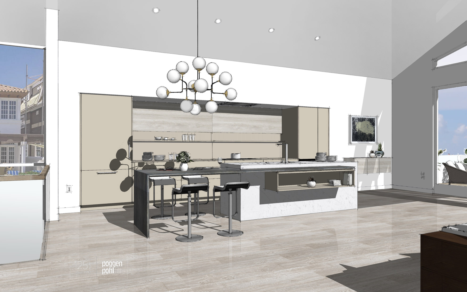
My idea was to create an open room and have the kitchen furniture fill the 3.8 x 3.5m footprint; I figured this would disqualify me but since they did not say where walls should be, if any, I wanted to make the kitchen fit into a large and exciting living space.

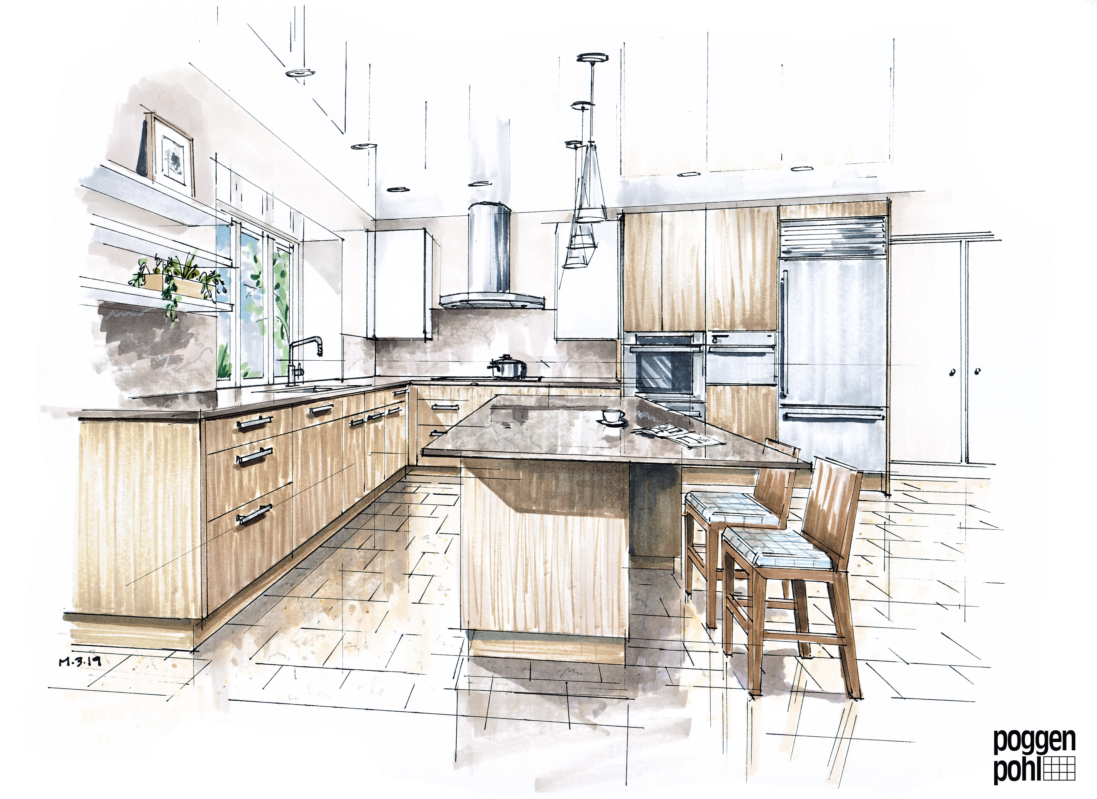
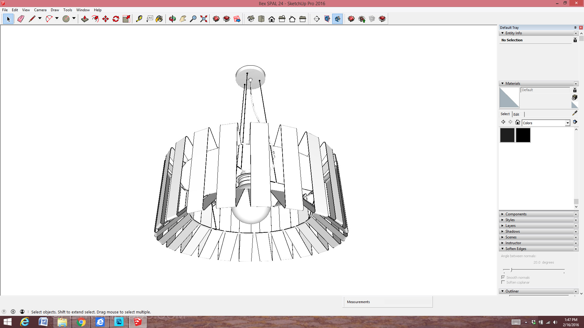
I put quite a bit of time into my Sketchup model, reverse engineering the Porsche cabinet products as close as I could. I only modeled the living room of the house but included the important outside views into the imagery as needed.

The main rendering, with an actual Swiss forest Photoshopped outside the windows.

The presentation was rendered “manually” by using Styles in SU and then exporting into Photoshop and embellishing. I’ve warmed up to rendering software a little bit over the past few years but I still enjoy making my own look.

The kitchen envelope.

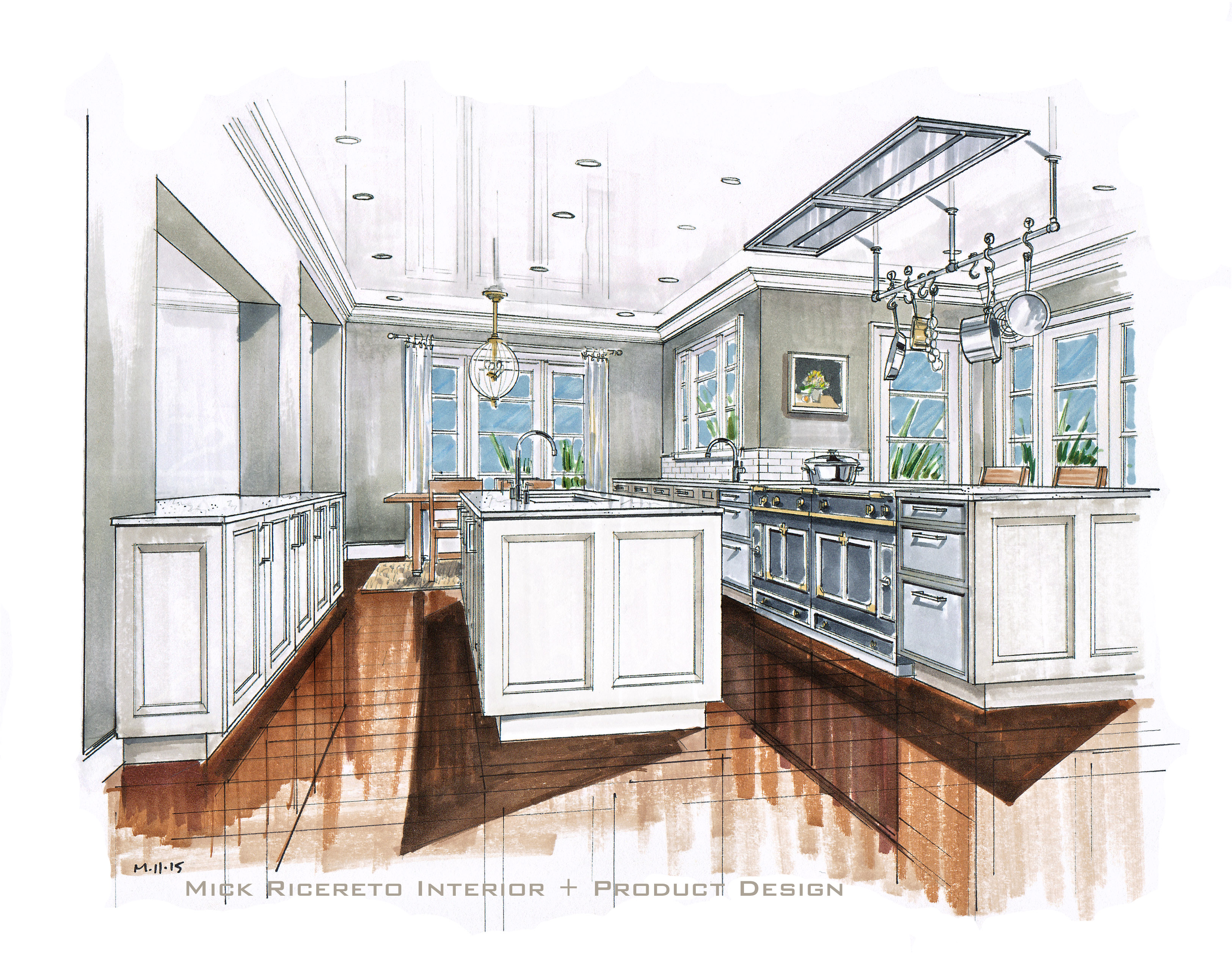
The kitchen itself fits within the required space while open on 3 sides. I have the oven and refrigerators accessible laterally along the walls – assuming a structural element is in the middle to fill the interstitial space – as I didn’t want to disrupt the free-flowing design. I spent weeks considering other ideas but ultimately went with my heart on this layout, then designing the whole house around it.

The Porsche system uses “blades” between cabinets as per the designer’s discretion. I employed a few of these as vertical accents but did not overdo it. Notice the shelf connects to the blades on the main elevation – and the left upper cabinet leaves a gap. This was one of my first ideas to try as the shelf is lighted glass within a frame and would add a nice feature to allow some eye movement around the design.

The island concept.

The island mirrors the offset feature of the upper cabinets and brings the whole design together. Due to the cabinet system’s reliance on stainless finished sides and lack of proper side panels, one cannot easily do a double-deep kitchen island. To get around that I interlocked shelves and different depth base cabinets to key it all together as a block.

So how did I do?

The contest closed in July of 2019. After several months of hearing nothing about this contest I assumed I didn’t place. The company itself was in disarray and communication in general was fairly limited. But, surprisingly one day in late October I rolled up to my house and saw this box on my doorstep.

Zubehoer means “parts” in German. I had no idea what this was until I opened it.

At first I thought, how could a client’s parts be misdirected to my personal residence? It wasn’t until I opened the letter did I realize it was from the contest.

My prize: a wonderful Porsche Design writing instrument.

This lovely Porsche writing pen was accompanied by a letter from the director informing me I had won the Best Overall Concept. Wow – months of silence and then a box on my doorstep telling me I won? I wish I had at least an email in advance; this box could have easily been stolen off my doorstep and I would have never known! It turns out the First Prize was the concept to be installed in Milano, not Best Overall Concept. I ended up seeing a very small brochure a friend found when visiting the factory, which showed the 1-3 placing concepts. No mention of Marko in that little gatefold. But again, the contest had left my mind and I was lucky an insider happened upon the leaflet. I liked the first prize concept a lot and it fit into a predetermined-looking space which makes me think that European designer had a little more information than I did.

So, no trip to Milano but I got a nice pen. Oh and lest we forget – Milano 2020 was cancelled due to the global coronavirus pandemic. So, in the end, this fantastic little pen!

Truth is I was in the process of extricating myself from Poggenpohl when I got this box and I quickly forgot the whole thing. In the meanwhile I reconnected with my first “love” in SieMatic and since then the Poggenpohl company completely imploded, going bankrupt and is now apparently in the process of closing most of their stores in the US.

Maybe I’ll finally take the Porsche out of the case and work on some SieMatic concepts with my new clients this week. I’ve got a great story to tell if they ask me about the pen!

Amerock Amsterdam Architectural Digest architecture Bath Design Bath Lighting Beaux Arts Brown Interiors Cabinet Hardware Cars Charleston Design French Design Furniture Hand Rendering Haus Fair History Icereto IMM 2015 Industrial Design Interior Design ISH 2013 Kitchen Design Kitchens Kitchen Trends Langestraat Lighting Lovell Beach House Mick Ricereto Modern Kitchen Design Montreal New York Norwell Lighting Philadelphia Pirch Rao Studio Rendering Schindler SieMatic Sketchup Timeless Elegance Total Home Design Urban Planning Urban Walks Vieux Montreal

Recent Kitchen Projects

Since January of 2018 I’ve been working with Poggenpohl, Germany’s oldest kitchen brand, since 1892.  I’ve done a variety of projects in the ensuing months, presented in both hand drawings and NPR/Sketchup renderings.  Here are some samples:

This first project is a lovely stone house c1913 on a quiet lane in the leafy northwest section of Philadelphia.  Always difficult fitting a modern kitchen into a small cottage with low ceilings and without ability to move any walls or alter much of anything architecturally.

Kathleen Hogan Light Oak 3_19

This next project is a beach condominium renovation, a complete gut/reconstruct which is centered around the kitchen and living ensemble.  Although the project has evolved considerably this original concept gives and idea of the space:

Morrison Main Update 8_7

This project is another beach residence, this time a new construction open plan retreat with sweeping views of the back bay.  The original, very quick concept sketch:

Leslie Kitchen Sketch

And after many changes, the final rendering.  The finishes are Sand Grey including a matching matte glass 11′ countertop, light and dark ash and the short-lived Silestone Silver Lake quartz for the mono-block island.  Short lived?  Silestone discontinued this finish almost as soon as they introduced it.  We loved the finish and searched hard to find the slabs as it was too heartbreaking to look for something else to reach the same effect.

Leslie 1_12 Revised

This next project is a sprawling 1980’s modern house in a pastoral Pennsylvania valley town.  1980’s houses are fascinating, with red oak floors throughout and original kitchens that still look good but have hopelessly outdated appliances and semi-concealed (and non-functioning) old Sub Zero refrigerators.  In this case, the original owners put in an Almillmo kitchen, and the new buyers wanted to keep in the spirit of the home.

We tied into the original Jenn Air downdraft location since a vent hood was not possible with the epic 20′ skylight down the middle of the room.  Looking out onto a koi pond, the space has a wonderful and well-lit feel.  We could not adjust the windows due to the stone exterior construction.

Jane New MODO 9_18

The best part of this project is how the owners came to acquire the property.  Jane, our client, grew up in the neighborhood.  She babysat in this house and loved the family who lived here.  After getting remarried in the mid 2000s, she was taking her new husband on a nostalgic trip down the old street when she noticed a for-sale sign on this stone-clad gem.  Seeking a new family home, Jane promptly made a winning offer and moved in with her new husband.

All the ensuing renovations and yard plantings have been sympathetic to her memories of the property.  She showed me a Polaroid of her babysitting in the house c1988 – and it still looks the same!  It was an honor to be part of such a passionate project.

Many more projects to share in future updates.

Autumn 2017; Recent Kitchen Projects

News from some recent projects; digital renderings in the non-photo realistic style – NPR – our latest visualization obsession.  First up – a display kitchen for a proposed showroom project:

Pure Modern Kitchen by Mick Ricereto

Working with lighting in Sketchup is tricky; most people export their model to a rendering package and work on materials and shadows.  We’ve been playing with staying in Sketchup, using Styles and doing this quickly and more loose.  As frequent readers know, I like our renderings to show some “hand” and be more conceptual.

Next is a kitchen project for an exciting modern lake-front house:

White Modern Kitchen by Mick Ricereto

This design was originally shown with a darker accent color but the client wanted to see it in all white as well.  We left the white glass backsplash for now but perhaps this could use a textured gloss tile instead for a little more pop.  The cubes are white oak boxes which will be back lighted with small LED strips.

Finally, here is another studio project, this one for SieMatic, using one of their signature styling photos (London’s “Gherkin” building):

Studio design concept by designer Mick Ricereto.

We were tempted to show the exterior street scene through the large glass windows but again, time can get out of hand when working on digital renderings.  Also, no need to be distracting here; the client knows what is outside of their windows.  This view shows an important table area that design staff uses with visiting clients – through the windows passerby can see some creative work in action, creating some buzz.  Whenever possible we try and make the entire space a working design as opposed to a static showplace devoid of life.  This is the third renovation for this particular client and we are always happy to work with our old friends in the business.

Future projects include some new lighting collections about to hit market, and also more kitchen projects – always kitchens!

Knocked Off Again

Knockoff.  Webster’s definition reads as “a cheap of inferior copy of something”.  A bit similar to “knock down” and “knockout” but to be sure I refer to plagiarized, and again by a big box store with the victim being an Amerock hardware design.

Rolling into the Box one evening looking for blue painter’s tape and some CFLs, I passed this forlorn little vanity ensemble:

img_3161

The unit’s cup pull is as close to my Amerock Manor pull as one can get, only not as wide.

img_3162

Here is Amerock’s official view of the Manor pull – model number BP26130 – for some reason shown from the bottom:

amerock-bp26130g10-lg

I designed this piece of hardware way back in 2003-2004, while living in Washington DC.  I used to wander the majestic avenues looking for architectural inspiration.  In this case, I was thinking of some details I liked in Daniel Burnham’s Union Station.  I’ve blogged about Union Station before I think … ah yes, here is a picture of the entrance vestibule:

Detail of Union Station in Washington DC

When I started with Amerock in late 2003, they were thick in the transition from a domestic manufacturing company to a run-of-the-mill importing brand.  Needing new designs to be made in China and appeal to the mass market, I whipped up some collections that would have timeless appeal and work with a myriad of cabinet and interior styles.  Manor was actually the first design I did for them.  In fact, the Manor knob was my very first design, penned in late 2003:

amerock-manor-square-knob

As I have stated before, I don’t mind so much to be knocked off as I can just design another knob or handle very quickly.  In this case I’m actually a bit proud to think a 13 year design still holds up enough to be copied so blatantly.  My goal of “timeless appeal” seems to have been met.

While I will continue using the world’s architectural monuments for inspiration – as any good artist should – some will simply copy other’s designs.  I don’t suppose there are great old buildings and fascinating streets to wander out in the Big Box corporate park, but that should not be an excuse for failing to come up with an original design.

Pirch Soho NY

On Saturday, May 21 Pirch Soho opened at the corner of Lafayette and Broome in New York City.  On Thursday, I attended the VIP opening party with the rest of the SieMatic and Fitch design teams.  As long-time readers know, I have been designing the kitchen areas for the Pirch stores, and Soho is unquestionably our best.  Here are some impressions of the finished store and the grand opening party.

Blog Subway

The buzz starts on your subway ride to Spring Street.  Pirch has advertisements throughout the subway using celebrities in the decorating and gourmet arenas.

Blog Ext Sign

The building itself is a fine old stone/brick manufacturing/office building, lovingly restored.  The store itself covers 32000 square feet and actually comprises space from at least two buildings, as the grade change and brick arches inside reveal.  The exterior brickwork and paint is exceptional.

Blog Exterior

Approaching the store after 6pm, guests experienced a velvet rope line up the block and tuxedo-clad “security”.  Yes, quite the buzz.

Entry View of Pirch Soho New York

Above is the view upon entry; SieMatic is the very first thing you see, even before the standard Pirch complimentary cafe.  SieMatic was very fortunate to get involved with the store layout early in the design process.  We were able to implement SieMatic’s vision of Timeless Elegance and Journey of Discovery by ensuring lots of space around each kitchen environment and letting the architecture inspire our layouts and material choices.

SieMatic S2 Agate Grey Soho New York

This first display features Gaggenau appliances, with a freezer and refrigerator clad with Black Oak veneer and the balance of the cabinets in Agate Grey matte lacquer.  The open layout and floating shelves are minimal and contribute to the spacious feel.

SieMatic SC40 Umbra Kitchen at Pirch Soho

As one walks throughout the space new display environments reveal themselves around wall blocks and glass screen walls.  As they were setting up for the party, some of the larger areas were dominated by catering and DJ equipment so this shows only a portion of what is on offer.

SieMatic Viking Display at Pirch Soho New York

Appliances on display include Sub Zero, Wolf, Viking, Miele, Gaggenau, Monogram … essentially the best available in the market today.

SieMatic 3003RLM Nutmeg display at Pirch Soho

SieMatic’s new 3003 door features a very thin 6.5mm edge detail in matte Nutmeg lacquer.  We mixed a very subtle aged bronze accent color into this display, as seen on the handles.  Up front we show another 3003 in Graphite lacquer, this one featuring Miele appliances and stainless steel accents.

SieMatic and Miele Display at Pirch Soho New York

Realistic seating areas are included where we could fit them, as this completes the domestic feel but also these areas are where the Pirch and SieMatic customer consultations start as guests receive exceptional and personalized service when shopping at Pirch.

SieMatic 3003RLM display in Pirch Soho New York

The Miele display is tucked into the window on the Broome side of the store, shown behind the stair area below.  This little display may not be much in size but when customers explore each area of the store little surprises like this small kitchen area come to life.

Stairs at Pirch Soho New York

Pirch offers kitchens, bathrooms and outdoor living furniture and fixtures.  A view to a bath environment on the second floor shows how the store designers (Fitch of Columbus OH) aimed to show complete environments in the design.  Note – all faucets and bath fillers and shower heads are fully functional for a very realistic experience.

Glog Bathroom

The spaces on the second floor are more intimate due to a lower ceiling and window height.  We responded to this feature by making the kitchen areas smaller and more realistic by building them in with walls and the ceilings properly.  This “Innovation Loft” kitchen takes up the corner of the second floor and is part of an apartment suite.  There are many home-organization and entertainment media screens embedded into the design like in the table and on top of the counter top.

SieMatic Loft Area at Pirch Soho New York

The loft is fairly small so a good view of this area was a bit hard to capture properly.  I didn’t venture upstairs during the party to see how this area was received but I’ll pop-up to NY occasionally to see how the store is doing “in action” and report back.

SieMatic Loft Area at Pirch Soho New York

We used as many new SieMatic features as we could, including these open shelves from the “URBAN” collection of furniture, quite appropriate to New York’s apartment-dwelling clientele.

SieMatic SC10 Graphite Cabinetry at Pirch Soho New York

Marcia Speer of SieMatic poses with me for our obligatory party shot.  Marcia and I work very close on these stores, selecting materials and shaping the overall product offering and interfacing with the Pirch team to get the mix of cabinets, counter tops and appliances just right.  In addition we have a team of bright designers, managers and installation experts at SieMatic who help put the whole thing together – too many to note here but they know who they are and if reading this, please recognize that I cannot take any credit for this work without your invaluable help!

Designer Mick Ricereto and Marcia Speer of SieMatic at the Pirch Soho New York Grand Opening

Next up for Pirch and SieMatic is the exciting addition of Austin TX.  We have almost completed this design and it should be open by early 2017.

I know this latest store is the best for SieMatic and Pirch and I’m sure it will be a smashing success.  When you are in NY please stop by and see the store and let us know how we are doing.

Knock Offs

I was recently walking a “big box store” – nameless for now – and noticed some private label cabinet hardware that carried an uncanny similarity to a design I did for Amerock a few years ago.  This doesn’t bother me as this sort of thing happens all time.  You know what they say about imitation and flattery.

Here are the designs at the ‘Box:

Here are my designs for Amerock, designed around 2007:

Amerock HandleAmerock Knob

My designs have a subtle curve the ‘Box models lack, but looking at the knob in particular I think we can say my designs have undoubtedly provided the inspiration for these retail pieces.

Discussing plagiarism in design is a important topic and a little too deep for me to tackle today.  In this case Amerock is not sold in this particular store; the product manager probably wanted to have something similar to my design, but could not find it in their manufacturer’s catalog.  In today’s product development environment, it’s simply a matter of sending a drawing (or “inspirational sample”) to your Far East factory and ordering the minimum quantity to have something very close in your store.

Another situation I have been meaning to post about is what happens to a design when it gets passed over for launch, but then mysteriously shows up in somebody else’s product lineup.  This happened with a mid-century-inspired bow handle I did back in the mid 2000’s.  Here is my design:

Bow Handle 2007

You are looking at a die cast and chrome plated “actual handle”, and two development prototypes.  At some point I changed the design from the awful 3-banded idea to this simple and frankly, “familiar” bow handle design that would have been a typical design in the 1930-50’s.  Our product team rejected the design in the end however, and we went ahead with some other products.  The die cast mold went on a shelf in China.

Then, a matter of a few months later I saw my design in the display of a competing hardware company, here in the US.  The factory had simply flipped it over to somebody else!  I studied it very closely but I was convinced it was mine and not some crazy coincidence.  Here is Haefele’s handle:

Haefele Handle

It may not be the actual mold, but the engineers could have changed it a touch and then passed the product over to this other buyer.  I just can’t see how my design would otherwise be so similar.  I have nothing against Hafele here at all – it’s been years since I have done this design and I just find it amusing.  I wonder how many of my other “rejected” designs may be out there under another company?

————————————————-

In other news, I have designed the kitchen area for another store for Pirch, the exciting appliance and fixture retailer – a great location in downtown New York.  The opening is later this month; look for a feature on the store in a few weeks time.

Working in Sketchup

Like many designers (and also hobbyists), I have been recently enamored to Sketchup.  For those unfamiliar, Sketchup is a free* 3D design software associated with Google (but sold off a few years ago to a company called Trimble).  I have been using SU to work on environment design (as opposed to product design), as it is very quick to get ideas across and quickly develop views to communicate your design intent.

Seating Area Sketch

3 Minute “Napkin Sketches” – Essential to the Design Process

Most will maintain that drawing by hand is an essential function to working out your designs.  Many are familiar with the story of a “napkin sketch”, or a squiggly Frank Gehry concept drawing; there will always be a place for quick sketches.  With tools like free 3D design packages however, detailed hand drawings are becoming too difficult to justify.

SieMatic Beaux Arts 2 Kitchen for Client in Bermuda

Hand Rendering – Charming but time to move on?

Did I say *Free?  The basic program is free but a Pro version allows many more features including the full-featured Layout element which is similar to Paper Space in AutoCAD.  I use Pro as I would like to master the Layout feature and eventually move away from ACAD.

Entry 2

Sketchup – A Quick Design and Communication Tool

As mentioned before in previous posts, I’m well aware the time-consuming method of drawing by hand is charming but inefficient in today’s design world.  Although I can draw quite quickly in a loose fashion (napkin sketches and so on), more and more of my clients are used to seeing photo-realistic renderings and as this becomes the norm pencil and marker sketches just simply will not cut it.  It isn’t the speed and the efficiency alone that renders hand drawings obsolete (sorry), but the fact that realism is so easily obtainable and frankly expected in luxury interior presentations.  Worst is when you need to present a few options in the same space; this is where digital designing such as SU can manage things in a few clicks.

Classic Main Alt

Basic SU Presentation.  No Post-SU rendering needed for quick images such as this.

Although my screen shots show basic line work, you can always export your SU model to a rendering package (also inexpensive) to get into photo realism.  It should be noted there are consultancies – many in Eastern Europe or Asia – who do nothing but make renderings of complex buildings and other important 3D projects.  These “Rendering Farms” have super computers toiling away to make your models look like the CGI from Skywalker Ranch.

After working in SU for a year or two, it became quite clear that although I don’t need CGI-level rendering yet, the quality of materials representation and purchasable interior elements make a big difference to the quality of your design.  Looking at my screen shots above, I’m referring to not only the realism of the stone floor but the appliances, the paintings I placed on the wall (small replications of a friend’s work), the chairs – all the things we called Entourage back in the pens-and-marker days.  With hand drawings you draw these elements yourself, or Photoshop things in later.  With 3D design, you can insert scale models of products into your room.  One of Sketchup’s most powerful features is their database of objects you can download and use in your design; the 3D Warehouse.

SU Warehouse Image

A View to Mick’s 3D Warehouse Page

The 3DW is a user-uploaded repository of free models.  If it has been uploaded to the Warehouse, you can use it.  Some “power users” display entire buildings and iconic models they constructed in the manner of a gallery.  I have seen the Empire State Building, Endeavor Space Shuttle, Tie Fighters … there are some incredible models uploaded to the 3DW.  For me and other furniture designers/manufacturers however, the 3DW presents a unique opportunity to get our products in the hands of architects and specifiers.  By having your commercially-available designs in the 3DW, there is a very good chance of having your pieces specified when the design gets executed in real life.  With this in mind, I have recently been converting my product designs to the SU 3DW format and uploading them for other designers and hobbyists to use.  In the first week I had a couple of hundred downloads of some of my lighting designs.  Who is looking at/using my product models?  This I do not know, as there is not a feedback loop or way to track who is using what.

SU Screenshot

Screen Shot of Sketchup Interface – and the Popular Ilex SPAL24 Space Array Fixture

So far the most popular of my products is the above Space Array fixture, at over a hundred downloads by itself.  Not bad for the first week.  I looked at some iconic furniture pieces by well-known manufacturers and their downloads were in the many thousands.  Surely some of these model usages will result in actual sales, right?

How many of you, dear readers, are using Sketchup and the 3D Warehouse?  Do you use actual products you intend to specify for the final project?  Does the availability of a model on the 3DW increase your chance of using it in real life?

With dozens of lighting fixtures currently in production – not to mention the scores of Amerock hardware designs I did between 2004 and 2009 – I could put a huge amount of product on the 3DW.  I’ll continue to focus on the newer and better designs for now, with the hope of getting a wider audience for my more marketable designs.

If you are a Sketchup user please have a visit to my product gallery and try some of my lighting and hardware in your models.  I’d love to know how they work in your designs.

https://3dwarehouse.sketchup.com/by/MickRicereto

Recent Projects and Renderings

As the holiday season gets into full swing here in the States, we are wrapping up some private projects, studio designs and renderings for other designers.  Everybody likes hand renderings so I will share some of the more interesting rooms we have been working on.

First up is a difficult kitchen space for our good friends in California.  This is a stunning house, but with an odd shape to the kitchen which took some clever design to get organized.  The designers moved some doors and windows around to get a better spatial flow to the room.  We didn’t do much here, other than render the design.  Cabinets are SieMatic Classic, in Sterling Grey gloss lacquer.

California Kitchen Rendering by Mick Ricereto

Next up is a more eclectic design in a very traditional house in South Carolina.  The client wanted something darker and more modern in this – again – difficult-shaped kitchen space.  We helped add some character to the room by designing a banquette and treating the existing brick wall with a Silestone wainscoting to tie the kitchen finishes and the architecture together.  I could completely see myself sipping coffee by the window on a nice spring morning.

Umber Gloss Lacquer Eclectic KitchenThis next project was a rendering for a real estate developer in Florida.  This is a small kitchen, but using the same care we use on our big design projects.  Where prospective home buyers would normally expect a basic digital rendering of the space, we like to think this accessorized and inviting view gives a better impression of the builder’s product.

Small Kitchen Rendering by Mick Ricereto

This next project are renderings for a villa in Hawaii.  The designers were looking to update the traditional Japanese-style interior to a more minimalist and clean look, while retaining the incredible inside-outside living that is unique to this climate.  First is the great room, with a view to the dining table and sitting area.  The kitchen is behind the camera in this view.

Hawaii Resort Interior RenderingThe floor here is slate, which continues inside and out seamlessly.  The sliding doors are shown here pocketed; there is almost no divider between the outdoors and in.  The next view is the bathroom, which has an open arrangement to allow a great view from the bathtub.

Hawaii Resort Bathroom RenderingThe bedroom has a similar set of sliding doors to the outside.  The piece on the wall is a Donald Judd-style wall sculpture.

Hawaii Resort Bedroom Rendering by Mick RiceretoBack to kitchens, here is our third prize winning entry to the Blanco Dream Kitchen contest from this past October.  The rules required the fitting of a Blanco sink and faucet (which we use extensively in most of our projects), but otherwise the design and style of one’s entry was completely open for creativity.  Our design is a very modern and modest kitchen using grey woods, stainless steel and for the room’s centerpiece, a black Corian custom angled island.  Our Ilex Space Array chandelier in black is above the sink/eating area, and this finish ties in to the blackened oak tall cabinets/room divider to the right.

Modern Kitchen Concept by Mick RiceretoI like how our Blanco project resembles the Hawaii resort above.  The lifestyle is not dissimilar, although our space is in a North American urban area; the desire to bring the outdoors in is an almost universal request when designing living spaces today.

The Blanco contest results can be seen in this issue of Blanco’s online magazine Here

The next project is a rendering for our colleagues in California, a kitchen for an industry executive.  We worked carefully on the proportions of these upper cabinets as the ceiling is a bit low and we didn’t want to misrepresent the design by making it appear taller than it actually is.  Hand rendering of course should be considered an “artist’s impression”, but that doesn’t mean we should not strive for accuracy in the design.

SieMatic Beaux Arts Class Kitchen Rendering by Mick RiceretoThis last project was done earlier in the autumn; a nice big traditional kitchen for our friends again in South Carolina.  This is an expertly-tailored space with some very nice door details.  Again, another kitchen with a lot of openings and a tricky space to design but I think the room comes together with an exquisite use of vertical proportions and a consistent horizontal datum.

SieMatic Classic Beaux Arts Kitchen Rendering by Mick Ricereto

In addition to these residential renderings we have some private kitchens and as usual, kitchen studio projects and other retail spaces on our boards.  2015 has been a busy year here in our new Philadelphia studio.  We look forward to some relaxation time this holiday season and continued growth for 2016.  Thanks for visiting the blog and please also see our Facebook page Here for photos, travel impressions and general goings-on at Mick Ricereto Interior + Product Design.


Recent Kitchen Renderings

We’ve recently done renderings for other designer’s kitchen projects.  Although my first inclination is to work in a more modern context, when helping out colleagues I’m often involved with “classic” designs.  These two SieMatic Beaux Arts kitchens are typical examples of a single-view rendering needed to supplement a high-end kitchen renovation proposal.  The client may otherwise only have a plan and elevation to fully understand the design intent; renderings help the project come alive.

SieMatic Beaux Arts Rendering by Mick Ricereto

This first example shows how the designers integrated the cabinets into the architecture of the room.  Careful planning of horizontal joints and header heights pull it all together.  Spaces like this – kitchen as hub of the house with many ways in and out – can be particularly challenging to work with but they did a great job in tying it all together.

This next project came with a low ceiling and existing skylight structure, for which the designers put considerable attention into the upper cabinets to get the right proportions.

SieMatic Beaux Arts Class Kitchen Rendering by Mick Ricereto

I needed to carefully draw my base layout to accurately portray the widths and heights of the design elements.  Since I draw everything by hand and do everything by eye/feel (no measurements whatsoever), sometimes there are false starts where you get the angle a bit wrong and need to start over.  Again I think this design solves the room’s challenges well and the interesting soffit bits keep your eye moving and make this a special room.

I’m often asked why I continue to do hand drawings when I could model in Sketchup or others and have unlimited views.  Well, I do actually, but hand drawings are fun and you “wright” a design instead of just click it to life.  The designer’s organic connection to the paper and the scraping medium which makes the marks (the pencils and pens) provide a feedback which is just different to working on a computer.

Another recent project was designed for a competition.  I’ll share the rendering here as it is a bit more my preferred flavor of style.  This is my design, from a completely white sheet of paper.  Lots of care went into finishes, such as stainless steel base cabinets, black matte oak on the tall cabinets/room divider at right, the deeply-combed grey oak floor and the angled black Corian island.  The idea was to place an interesting island in an otherwise basic square room to show how just a few new ideas could create a dynamic design.

Modern Kitchen Concept by Mick Ricereto

The island has a polished stainless steel leg on only one side.  I tested this in scale and with the massive base at the left end, it is remarkably stable.  Notice the shadow lines above the shelf at left and black oak wall divider cabinets at right; I do not like taking cabinets to the ceiling and much prefer to use a shadow gap.  A gap at the top expands the room visually and is easier to install.

We have been busy with some industrial design projects and helping out with the Design Philadelphia festival here in town.  I’ll post more hand renderings from time-to-time so thanks for viewing and see also our Facebook page for other recent projects.

Visiting SieMatic Amsterdam

In previous posts I covered my voyage to Germany with SieMatic’s North American design partners for our visit to IMM – the furniture show in Cologne.  After the show we jumped on an ICE high speed train at 300 km/h to see SieMatic’s new flagship showroom in Amsterdam’s Vondelpark neighborhood.

SieMatic Amsterdam Exterior

This new studio is unique in many ways, one of which is full integration into this wonderful old townhouse steps away from the Vondelpark, a lovely urban green space just a couple blocks away from the recently renovated Rijksmuseum.

As we discussed above, SieMatic has revolutionized their approach to displaying product towards one of full, realistic environments.  The full building envelope is part of the experience, much the same as any top-level luxury product.  The townhouse selected for the studio itself is magnificent and no doubt provided the designers from Schepers Architects (along with SieMatic’s in-house department) tons of inspiration for the layout.

Entry At SieMatic Amsterdam

Upon entry you can see how the space is divided, as you choose to go up or down to the visible, inviting living spaces.  The effect is like a peek into actual apartments, as the individual spaces are decorated so well it looks as if the residents had stepped out minutes prior.

White SieMatic S2 Kitchen at SieMatic Amsterdam

This is the first display upon going down the first landing.  This is the S2 series in Lotus White gloss, accented with only stainless steel and Titan Oak veneer.  The herb garden is congruent with the trend we saw in Cologne.  The backsplash compartments seen below are used many times in the this studio.  These small details impressed me over and over; the individual displays show a masterful hand for detail.

Herb Garden Island

The apartments blend into each other with transition spaces, such as below.  Large walls have clever lighting and copper panels with a patina effect, combined with photo murals.  These scenes compliment the style of the room and bring the whole ensemble together.  These transition spaces are shared between several kitchen alcoves, but the effect is one of overall harmony as together they feel like an expansive, single environment.

Transition Area

The furnishings and decor are expertly chosen and curated.  Remembering we are in Amsterdam – a city of small apartments and narrow townhouses – the designers and studio staff have honed in on what works for their local market and the types of buildings they will be asked to work with.

Small Amsterdam Kitchen Display at SieMatic

Above is an S3 kitchen, using a combination of materials in a smart manner.  I like how the architects kept the window frames black in all the rooms – a nice unifying feature – and played off it with dark accents wherever possible.

Kitchen at SieMatic Amsterdam

Amsterdam has small houses, and yes the studio addresses this with small display environments.  I found these small rooms to be very inspiring.  The use of shelves, decor, creative backsplash storage elements and use of color and materials is again masterful.  The above display sports this fantastic storage wall behind the cooktop and sink:

Creative Kitchen Backsplash StorageOn another floor is this transition space with a wall of gloss Graphite panels mirrored by a copper/photo wall.  Instead of merely moving you through to the next space, I found these transitions to be very inviting and like a palette cleanser as you moved to the next apartment.

Another Transition Space at SieMatic Amsterdam

In the upstairs spaces the original building details are more visible, and the entire top floor feels like one grand apartment.  The kitchen furnishings are still quite modern here, but the overall feel is still Classic as the room environment is the rightfully steers the room’s style.

Classic SieMatic Kitchen Environment

The other spaces are just as nice or even more so, with integrated work spaces for consultation with clients or in our case, for a luncheon meeting for 20 people.  As I mentioned in my IMM posts above, I had come down with a fast case of flu and unfortunately didn’t stay in the showroom for to document everything.  I’m sure my colleagues were glad I didn’t spend too much time in general population.

Overall, this studio presents a very convincing luxury environment, and one undoubtably effective at making Amsterdammers feel at home.  Although this presentation is quite different than say New York’s flagship showroom, it is still undeniably SieMatic.  And in my office, as we work on future SieMatic projects, this will be our challenge; as we renovate spaces around the world, we shall increasingly draw on local conditions and inspiration for new studios without diluting the unique luxuries of SieMatic’s global brand.