Charleston and Middleton Plantation

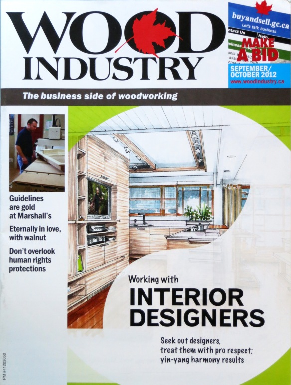
SieMatic held its annual sales meeting in Charleston SC this past weekend.  Readers may recall my Kitchen & Bath Business Magazine award-winning showroom design for SieMatic Charleston (read about it here and here).  There was a great crowd attending with SieMatic dealers from all over the USA and Canada.  After presentations from noted kitchen designer Mick DeGiulio and interiors photographer Evan Joseph of Architectural Digest fame, we took in some nice weather at the plantation.

Middleton Oak near Charleston, SC

This is the Middleton Oak, a Quercus virginiana (Live oak) looking over the Ashley River.  This is the largest single-stem Live oak in the southern US states and although it has declined a bit in recent years, it is still impressive.  Live oaks tend to have copious amounts of Spanish moss draping their limbs and the Middleton oaks deliver:

Live Oaks with Spanish Moss

After a couple of days of dodgy weather, it was about 60 degrees during our tour – perfect for strolling the grounds before our afternoon meeting wrap-up.  The sun brought out a small alligator to the shores of a pond and a lovely peacock browsing some grass right near a pathway.  This peacock went his (her?) way and was not bothered by our presence in the slightest.  We wanted it to spread it’s tail and make a big show but he (she?) seemed content with us snapping away with our cameras.

Peacock at Middleton Plantation

The spring house bathed in early March morning sun.

Spring Pond at Middleton


On the second floor of the spring house is a tiny chapel.  The stark white interior was a wonderfully restful little space.

Middleton Chapel Detail

Part of our group at the highest point of the plantation, looking out over the Ashley River.

Middleton Plantation

My friends Beverly and Keith Binns (of premier kitchen and bath studio Binns in Toronto, Ontario), posing in front of the main plantation house.  Note the Flemish design of the house; Henry Middleton toured Europe with his new bride and came back with fresh inspiration for his new home.

Beverly and Keith Binns at Middleton Plantation

Another massive Live oak, this one a “twin”, as opposed to a single-stem specimen.

Live Oak at Middleton

Notice the sandy soil.  We wondered if this was so bare due to the shade of the tree, or something in the soil.  With the moss and leaves covering the ground and changing the ph, maybe natural ground cover just can’t get a good start in this soil.

During another break in the conference, I took a quick walk down King Street in the center of town and went through the campus of Charleston College looking for more nice old trees and buildings.  Some scenes from the campus grounds:

Charleston College Building

A lovely old gatehouse at the bottom of the old quad:

Gatehouse at Charleston College

It was very quiet, so I think it was spring break.  Here is an unusual white-painted wood structure with great classical detail on the edge of campus.

White Charleston Building

I love the subtle contrast between bright white trim and the dove-colored siding.  This last shot is the head house at the ancient market square.  I ventured down the road a bit just to re-visit this building.  The coloring is very interesting to me, being used to red brick and white trim Federal buildings of Philadelphia and Baltimore, and the Beaux Arts marble and limestone of Washington and New York.

Market Building Facade

It is always great to attend these events and see dear old friends and catch new design inspiration.  I will most certainly be back to Charleston, since I have business here once a year or so.  Good thing, as I was reminded of another plantation called Drayton Hall, which is not far from the city.  I’ll have to make time to get back for that one, and a more comprehensive tour of the Charleston Singles and other unique structures of the enchanting old city.

Another Magazine Cover – Canadian Wood Industry

Another of my renderings was used for a magazine cover.  This time it was the October edition of Canadian Wood Industry, who used my Schindler Lovell Beach House concept in an artistic manner, for an article about working with Interior Designers.

Wood Industry Cover Rendering

My Lovell Beach house concept can be seen here: https://mickricereto.wordpress.com/2012/06/04/a-kitchen-proposal-for-schindlers-lovell-beach-house/

It has been a busy year, with more renderings and great projects on my desk right now.  More updates soon, as projects develop.

More Classic Modern Displays

Since my last post in November (already a month has gone?!), I have been working on more showroom displays in a “Classic Modern” vein.  Here are some renderings; first up is a concept for a store in South America:

Exterior Concept for SieMatic Showroom Studio in South America by Mick Ricereto

Before doing an entire store layout, we decided to render just a concept of the front of the space, to show how warm and inviting we could make the furniture layout from the outside.  When a given space has windows on 2 or 3 sides, it does wonders for publicity but can be a challenge for a kitchen showroom.  Our concept shows how we integrate a “Total Home Design” feel to the entrance; visitors can see a kitchen and a sitting/living space complete with TV, seating, fireplace.  The kitchen and living space are designed in harmony as one, the way home renovations should be considered.  I have been lecturing about this type of renovation and will post on my concept of Total Home Design in the future.

A detail view of the kitchen; notice how the “soft side” of the kitchen is arranged towards the living area (with wood shelves and a wood seating area), and the “hard side” which is water and stain-resistant, faces away from the seating and allows kitchen play and it’s inherent messiness to stay isolated from the soft side.  Finishes are Agate Grey gloss lacquer and Honey Walnut veneer.

The upper cabinets bridge over the way into the rest of the studio.  This bridge connects to the fireplace/entertainment unit and helps tie the design together.

Kitchen display concept for South America; SieMatic Agate Grey Classic Modern

Next up is a concept here in the US.  We have a large showroom which we are considering renovation, but again, want to make the front entrance as inviting as possible.  The same classic modern Agate Grey finish was selected, this time mixed with Graphite lacquer.  This display is more of an “entertainment center” or “wet bar”, with sink, coffee station and refrigerators behind panels.  Again we see a bridge to the seating area.  Across from this setup is the main kitchen, which is a more formally-presented Beaux Arts 2 display.  The idea is to keep the entire space in harmony.

SieMatic Agate Grey Kitchen/Entertainment Center Concept

It has been a busy close-out of the year, with exciting projects all over the globe and some extremely satisfying industrial design projects as well.  I have been considering new 3D software in the new year, if I can make up my mind on what to go with and then commit the necessary time for training.  Looking forward to 2013 being as diverse and exciting as 2012 has been!

Classic Modern Kitchen Displays

We are currently seeing a strong trend to “warm-up” modern luxury kitchens.  Cabinet finishes are trending towards high gloss again, with the addition of gloss metal finishes and a general sparkle effect throughout the entire range of materials.  There are often two strong tones (light and a bold darker tone), which keeps the eye moving.  Dark gloss tones strongly reflect everything around them, which adds spatial dimension.  This new display concept from SieMatic shows how flat cabinet doors can be used to a luxurious, but modern effect:

SieMatic Agate Grey Gloss "Italian Townhouse" Kitchen Concept

Notice the overall grey palette with strong contrast in the marble and gloss black cabinet finish in the middle of the display.  The “top boxes” are the most dominant design element, reaching up to the ceiling.  I love the irregular rhythm of divisions at the top, which were undoubtedly based on some Golden Ratio sizing.  Picking divisions like these are similar to writing a melody; you want to avoid simple monotony, but if you go too far the song will not be catchy or may be jarring.  In the case of these top boxes, it is quirky enough but definitely does not go too far.

For a recent display here in North America, I am working with similar finishes and the need to have a crisp, elegant feel.  Our envelope included a full-height window in the corner, so the use of top boxes made perfect sense.  I recessed the Graphite gloss oven cabinets under the main Agate Grey plane for emphasis.  On the adjacent wall the end is anchored by Graphite panels with vertically-adjustable thin shelves.  Just enough classic elegance is added by using the Beaux Arts mirrored toekick and gloss-nickel tall glass doors.  A sliding stone panel backsplash reveals a walnut shelf for just a touch of third finish (repeated inside of tall glass doors as well).

SieMatic S2 Agate Grey Display by Mick Ricereto

The plan shows the unusual parcel we had to work with.  There is a seating area to the left (out of view) with a wall of panels and shelves, much like the SieMatic example above.

SieMatic S2 Agate Grey Plan by Mick Ricereto

I have been very interested in the trend of irregular open shelves which began two seasons ago in Milan.  However, this latest, more elegant use of closed cabinets and tall elements is really starting to look fresh and exciting.  It is great to have modern and classic blending so closely now, as in the past a client would identify herself as being, say, “country” or “contemporary”.  Those division lines are long gone as we enter a cross-harmony of sturdy historical values and the fashion and freshness of the new.